Internal CRM Dashboard Project(s)
Objective: I was tasked to develop a comprehensive dashboard to enhance sales team efficiency and provide actionable insights for management.
The first dashboard designed for internal staff (customer managers), was to seamlessly blend KPI and dashboard metrics from SQL to the Salesforce data pipeline. The idea was to scroll through all client domains to assess if any of them were falling behind in their contracts and other end-user insightful data that could be leveraged for sales/improvements.
My Approach:
I was going to make custom KPI dial metrics for good UI design that would allow a quick snapshot for sales to understand who was performing well and who was not. There were also thresholds coded into the dashboard that changed colors depending on their values
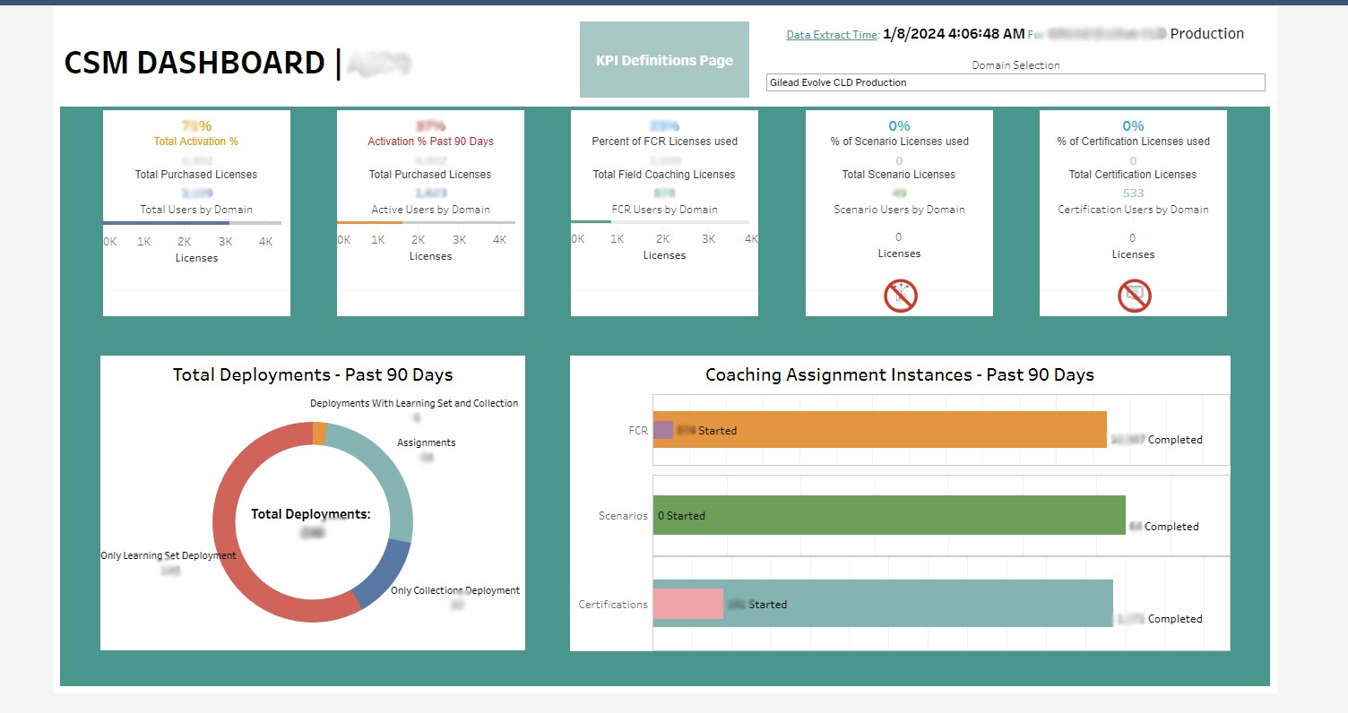
I have blurred out sensitive data; starting from the top right:
It shows the last timestamp of extracted data from the tableau server (constant refresh from Salesforce/SQL)
Client name the dashboard is on
Drop-down to select from the list of client domains to get a snapshot of the rest of the data
Activation numbers, converted to percentages, with color coded thresholds that change depending on value
High level overview of general metrics for end-users using the platform
Definition page for anyone who requires additional information on the KPI's presented.
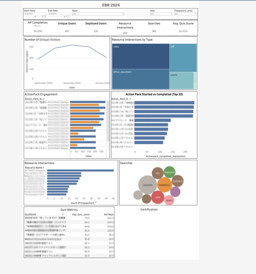
The above is an EBR template that has different interactive controls for filtering user data based on name, team name, cohort, start/end dates and user.
Can be used for multiple clients if needed (streamlined).
Drop-down to select from the list of client domains or filter by user to get a snapshot of the rest of the data
Activation numbers, converted to percentages, with color coded thresholds that change depending on value
High level overview of general metrics for end-users using the platform
Shows level 2 metrics for KPI's regarding learning content
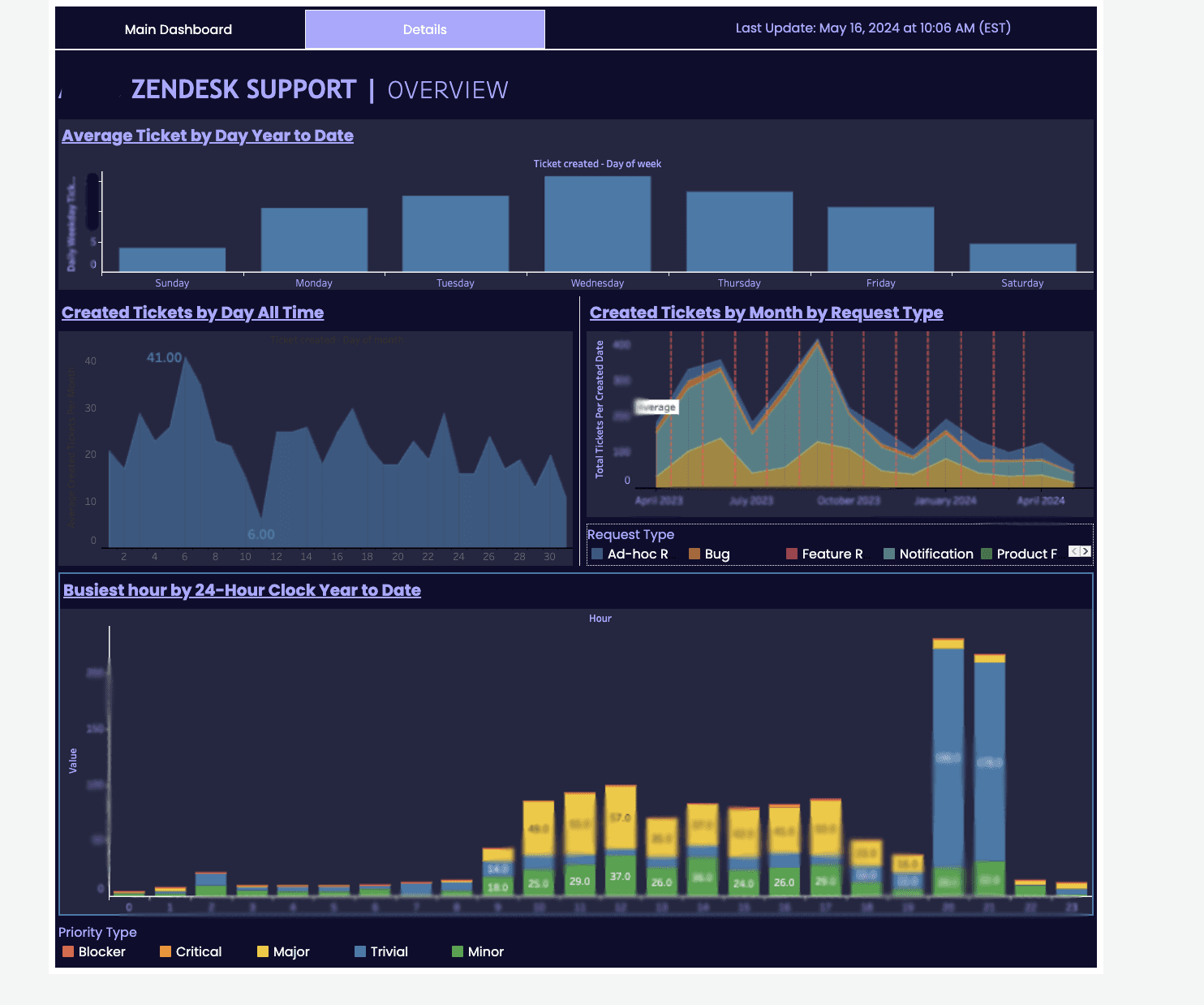
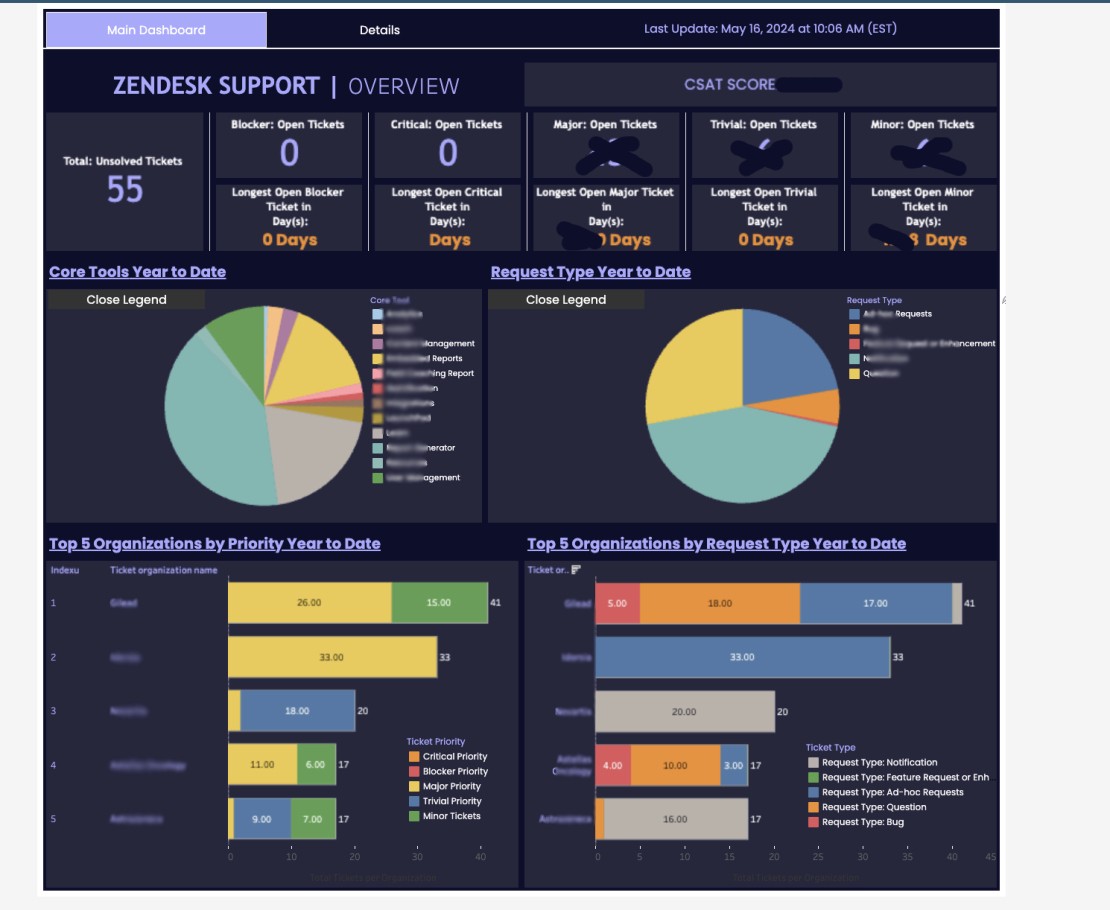
The above is a custom made Zendesk Tableau dashboard that has two parts. The first main dashboard displays important key support metrics, along with the list of priority clients affected and also prioritized by type of issue. The second tab accessible on the top left "Details" opens another dashboard that shows deeper analytics for each type of issue to track and forecast the types of issues that come in and if there are seasonal patterns that can be mapped based on hour of day or time of month.
Key Achievements:
Increased overall sales team productivity by 20% through centralized data visualization
Reduced time spent on reporting by 15 hours per week
Enabled data-driven decision making for resource allocation
Technical Highlights:
Integrated data from multiple sources including Salesforce, Zendesk, internal databases, and Excel sheets
Implemented complex SQL queries for data transformation and aggregation
Created interactive filters allowing users to drill down from high-level KPIs to individual sales rep performance
Designed custom calculated fields for advanced sales metrics and forecasting
Challenges Overcome:
Optimized dashboard performance to handle 1M+ rows of data with sub-second response times
Implemented row-level security to ensure data privacy across different teams
Developed a mobile-responsive design for accessibility on various devices
Soft Skills
Conducted client interviews to gather specific requirements and align on project goals
Led iterative design sessions, incorporating feedback from customer success director and C-suite executives
Provided training sessions for 15+ internal staff, ensuring adoption and proper utilization of the dashboard